Learning Patterns on Duolingo
By Matthieu on Friday, June 5 2020, 18:15 - Permalink
This is a graph I made using Gephi to show the number of Duolingo users learning which language from which. Colours represent language families.
English of course stands out as a hub. Duolingo users can learn any language from English, except Catalan and Guarani (from indigenous around Paraguay) which are learned from Spanish. Asymmetric drains are seen towards French, German, Japanese, Korean, and Italian to some extent. The network rather follows geographic proximity, with the notable exception of the Arabic>Swedish stream, accounting for the great effort of migrants to integrate Swedish society.
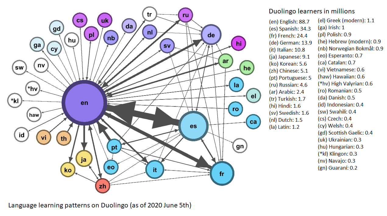
(click on the graph for a bigger picture with explanations)
Data review on June 2021 didn't show much change.
This is an example of semi-structured graph based on a data matrix. The interesting aspect of it is that the shape of the graph emerges from its inner structure, by optimizing the proximity and arrangement of the nodes linked together. Like letting the data spontaneously express itself and grow into a particular pattern.